The basics
1 Frequently used terms
Tracking
Tracking refers to uniform changes in the spacing between characters within a selected piece of text. While adjusting the tracking of display type is common, a designer should avoid doing this to body text. A designer may want to adjust the tracking of body text to avoid orphans or widows in a design which can be typically be accomplished by selecting large amounts of text (one or two paragraphs at a time) and making minor adjustments of ±10/1000 of an em, though less would be best.
![]()
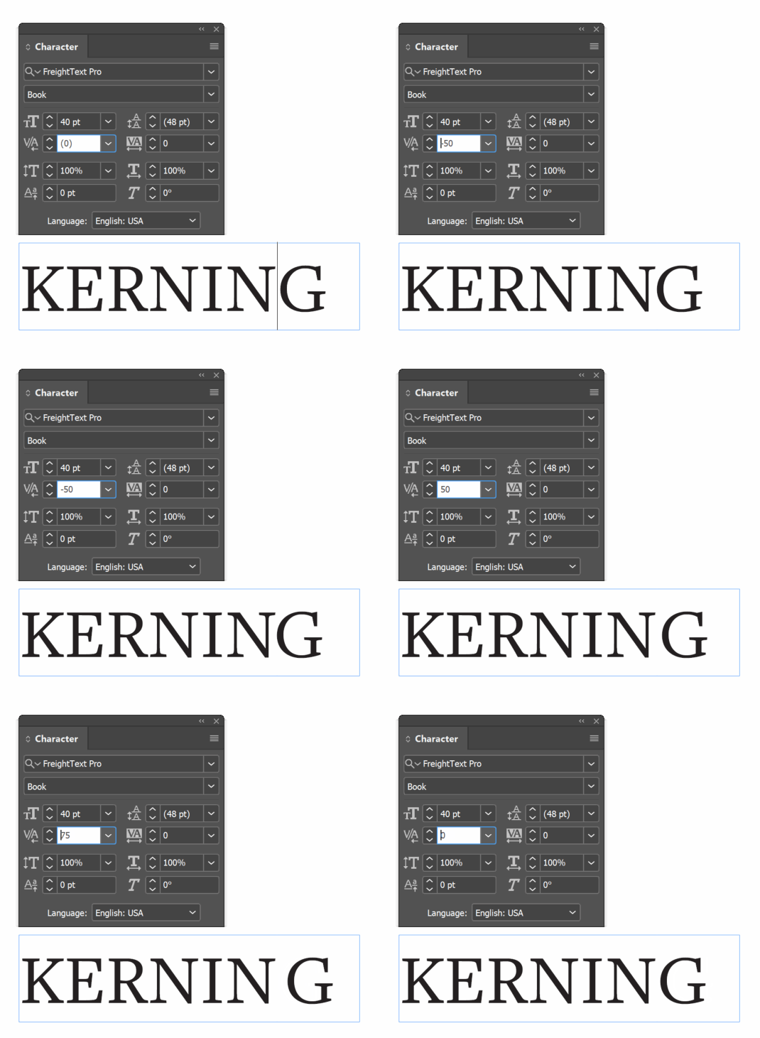
Kerning
Kerning is the spacing between individual characters. Kerning is defined within a typeface but sometimes is done poorly, or you are working with a problematic pair of letters (e.g., AV) and you must fix it yourself. Kerning is usually reserved for display type and is not required for body text.
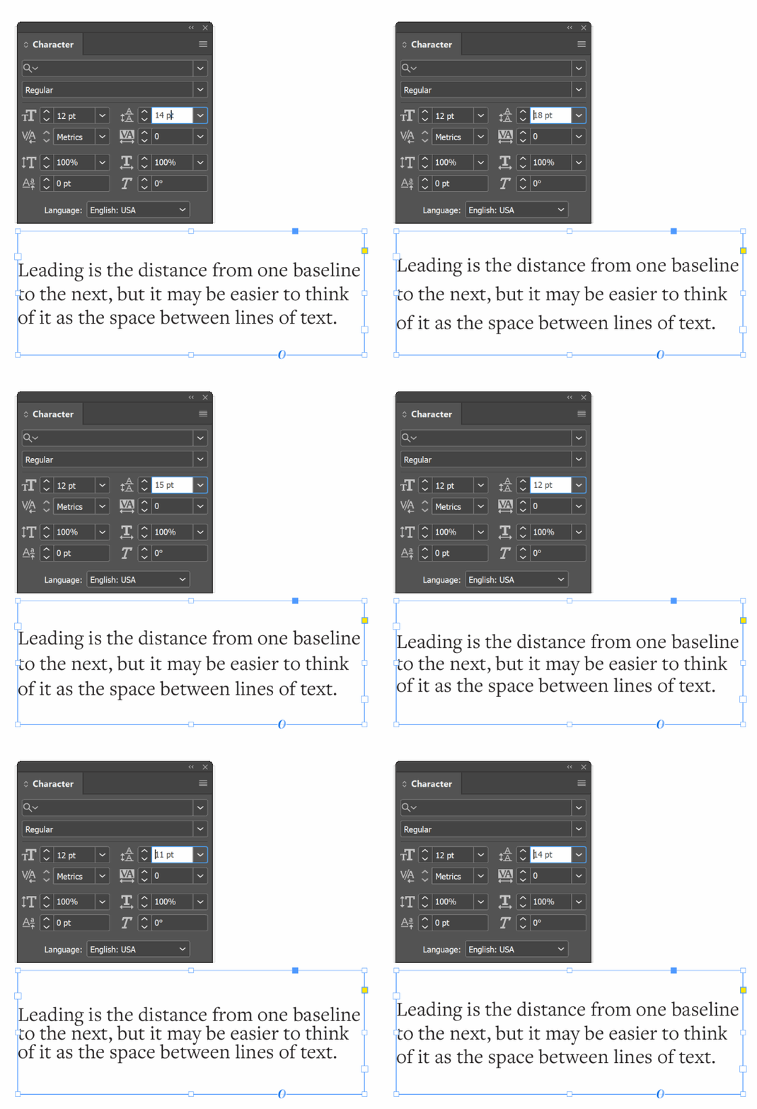
Leading
Leading (pronounced LED-ing, not LEED-ing) is the distance from one baseline to the next, but it may be easier to think of it as the space between lines of text. Standard leading is 120% of the point size (e.g. 10 point type would have 12 point leading), though a realistic range for body text could be between 120–145%. Display type may be also set solid (100% leading) or even set with negative leading (less than 100%) as text gets larger.
Text and display typefaces
Text typefaces are for typesetting at between eight and 16 points, though it is safer to stick to between 10 and 12 points. A typeface used for text type should have high legibility, not grab attention, and be easy to read for long periods of time. Highly legible fonts can be identified by their large x-height, open counters, and low contrast between thick and thin strokes.
Display typefaces are for typesetting larger than 14 points. Display typefaces are all about drawing attention, making a statement, and communicating meaning at large sizes. Typefaces used for this purpose don’t need to be as legible as a text typeface.
The symbol that represents a letter (e.g., an uppercase E). See clarifying confusing terms.
Anything set above 14 points is considered display type. See frequently used terms.
The main text or content of a designed piece, typically sized at eight to 14 points. May also refer to a typefaces optical size that is designed for us in body text as opposed to display type. Typefaces chosen for body text should focus on high legibility.
A unit of measure that is equal to the current point size. If your typeface is set to 12 points, an em is 12 points. See measurements.
Typefaces or text intended to be used in large sizes (over 14 points) and with only a few words (e.g., headlines, logos, etc.). Display type will typically have lower legibility and be more decorative than those intended for use in body text.
The invisible line that most characters rest on, or at least what their position is based on, and that descenders extend below. See measurements.
A term to describe text that has leading that is equal to the point size (e.g., 10 point text with 10 point leading, or 10/10). This is not recommended for body text but is acceptable for display type, though you may find that ascenders and descenders can now make contact.
The term for leading that is less than 100% of the text's point size (e.g., 24 point text with 20 point leading). Only recommended for very large text.
A commonly used unit of measure for typeface sizes. It is 1⁄72 of an inch or 1⁄12 of a pica. See measurements.
The measurement of the distance between the baseline and the mean line. This measurement is based on the height of a lowercase x, hence the name. It does not include ascenders or descenders. See anatomy.
A partially or fully enclosed area within a character. See anatomy.
The difference in weight between the thickest and thinnest strokes in a typeface. Related to axis and stress. See anatomy.


