Analysis of Phenotypic Variation in Pillbugs
3. Data Analysis: What is the extent of variation in phenotypic traits?
Obtaining measurements of traits is only the beginning of investigating phenotypic variation. In order to make meaningful comparisons, data must be summarized using descriptive statistics and displayed in a graph or table.
Use the pillbug data you collected in the lab for the analysis below. You will be determining if there is variation in traits, and if the degree of variation is consistent between traits. Use Excel for this and future analyses – you will be submitting your Excel file for feedback as part of your assignment.
1. Calculate the mass specific CO2 produced (ppm/gram of pillbug). First calculate the amount of CO2 produced per individual (final minus initial). Then divide that value by the mass of the pillbug.
2. Calculate the percentage of times picked up that the pillbug rolled. (e.g., if rolled 3 out of 5 handlings, the percent rolled would be 60%).
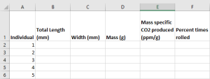
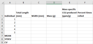
3. Enter your data into Excel starting with individual number and then have the trait across the top and the values below. Each row will be the values for one individual. For example:
4. Use functions and formulas to calculate the mean, standard deviation, and coefficient of variation (i.e., descriptive statistics) separately for each trait in the row below your data. This will allow you to autofill the rows quickly for all traits. Refer to the Essential Resources document for formulas and tips on using Excel for your data analysis (specific sections are listed on eClass).
5. Make a summary table in Word with the mean, standard deviation and coefficient of variation for each trait. Be sure to have an appropriate number of decimal places to indicate the degree of confidence for the measurements (e.g., one decimal place for length and width). For information making tables, please see the Essential Resources document (specific sections are listed on eClass).
6. Make a scatterplot that addresses this question: Is there a relationship between mass and the percent of times an individual rolls. In this case, the mass will be on the x-axis and the percent of times an individual rolls will be on the y-axis. Be sure to add a linear trendline to your graph and add the equation of the line. If you need help knowing why we are using a scatterplot, and how to make one, please see the Essential Resources document (specific sections are listed on eClass).
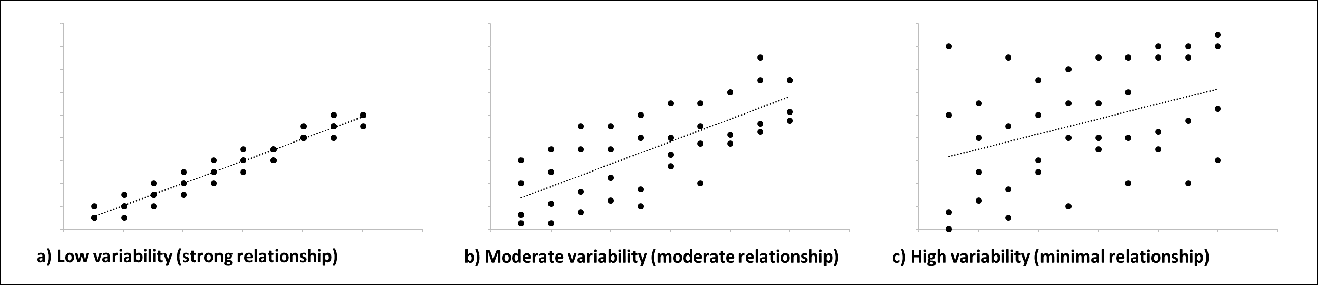
A note about variability!
You will be asked to assess whether there is a lot of variability in Figure 1 after adding a linear trendline. For this, you are going to be looking at the spread of the points around the linear trendline. In future classes, you will be carrying out a statistical test (linear regression) to determine how strong the relationship based on variability, however, in AUBIO 112, we are simply doing a visual assessment. So, how do you decide if there is low, moderate, or high variability (resulting in a strong, moderate, and low relationship, respectively)? You look at the spread of the data around the trendline – the closer the points are to the linear trendline, the less variability there is in the data (a-c).